Disorientation Week
Disorientation Week was an 8 day back-to-school event for MacDinton’s SoHo , packed with daily challenges, prizes, and drink specials, all leading up to a grand finale. With a lot of details to communicate, the goal was to create a cohesive and engaging campaign that captured the chaotic excitement of the week.


Challenge
Design a dynamic campaign for an 8 day event, optimized for both social media and print, while clearly organizing daily specials, challenges, and finale details.
Solution
Design Details
Page Fold
To create a realistic page fold with accurate highlights and shadows, I used a notebook I had on hand. By folding a page, I could observe how the lines curved and how the shadows formed. I then took a photo to capture it in 2D, which helped me recreate the effect by using shapes in my design.


Doodles
To create doodles for my design, I had friends sketch things they would normally draw while zoning out. I wanted them to feel unplanned and disordered, fitting the theme of "disorientation".
Each day’s graphic features doodles that relate to the games or specials, scattered across the design like random thoughts filling the page. I then scanned and digitized them, refining just enough to keep their raw, hand-drawn effect, adding to the playful sense of disorder.


Handwritten Text
I avoided using a font for the handwritten text because it lacked the variation I needed and would look too clean. I wanted it to feel like real notes, rough and imperfect.
I typed the layout in Photoshop, exported it as a PNG, then traced it in Procreate with a pen brush to add natural inconsistencies. After bringing it back to Photoshop, I adjusted the layers to make it look like notes on a page.

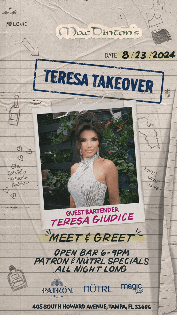
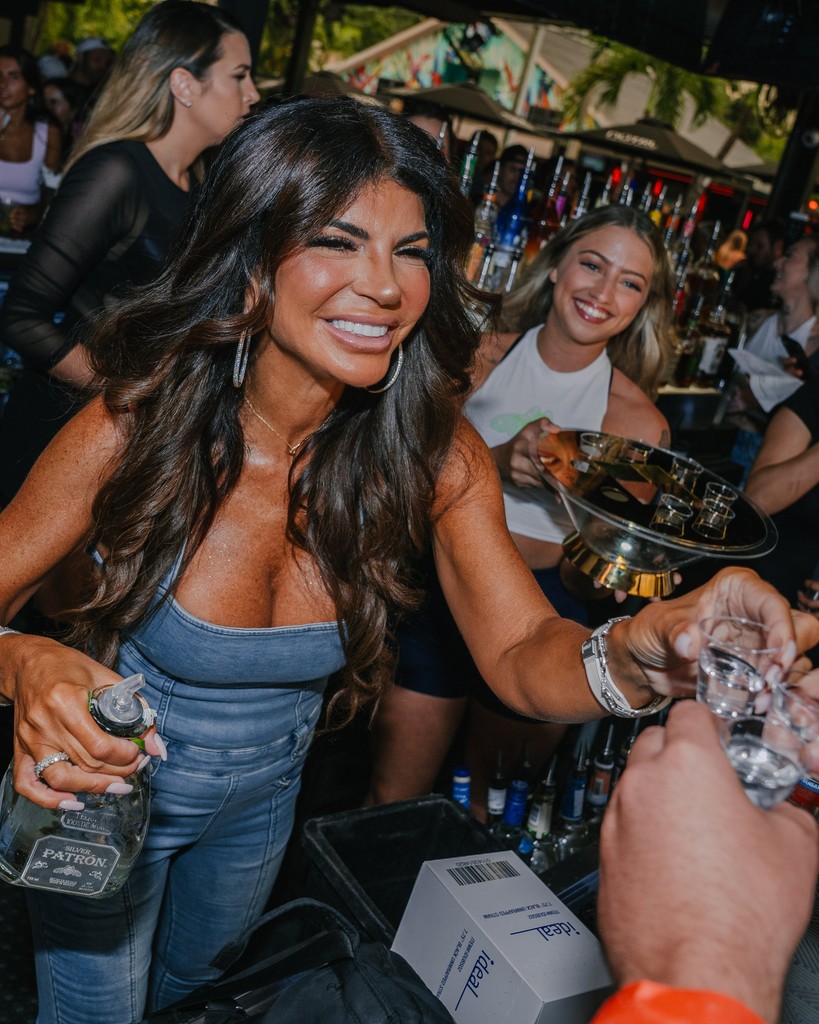
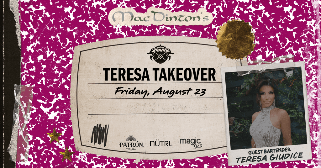
Teresa Giudice and Patron Collab